Top 5 Web Design Trends for 2024
- 22.07.2024
- 1 views
- 6 min
Web design trends are always evolving
Web design trends are always evolving. The drive to offer users unique experiences, combined with advancements in AI tools, leads to new and exciting trends. It's important to stay informed about these trends, especially if you plan to incorporate them into your site.
However, it’s not mandatory to always adapt your website to the latest trends. While they can enhance your business concept and keep your site looking modern, they also provide beginners with a foundation to understand what’s currently popular and worth exploring.
Incorporating trends thoughtfully can make your website look fresh and up-to-date, but it's equally important to prioritize functionality and user experience over simply following trends.
The development of mobile design
Many users access websites via mobile devices, whether during working hours, in the car, or on the street. Therefore, it's crucial to ensure your website is well-optimized for mobile use.
The approach to website creation has evolved, with many now starting with the mobile version before adapting it for desktop. Mobile sites should be concise, making it easy for users to absorb information quickly. Additionally, images and videos need to be optimized to ensure that even users with poor connections can access your content seamlessly.
One significant advantage of mobile websites is their ease of promotion through social media platforms like Instagram. People scrolling through posts or viewing stories can effortlessly access your site and potentially make purchases directly from their mobile devices.
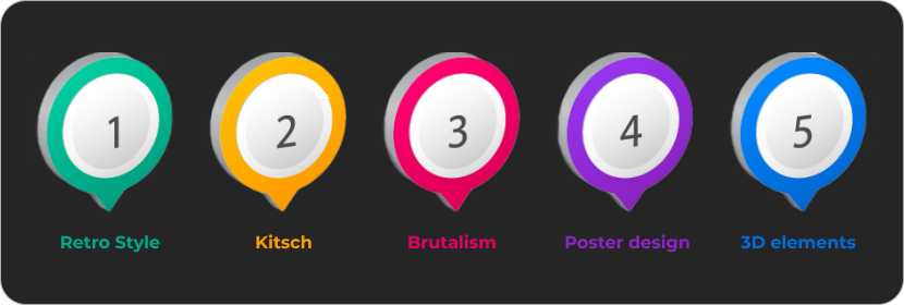
Retro Style
Looking back to the origins is essential as it can help you discover something new in the nearly forgotten past. Retro designs bring extraordinary vibes to websites.
This style includes the use of pastel colors, black-and-white photos, illustrations, ribbons, postage stamps, and hand-written or typewriter fonts.
There are numerous ways to implement retro styles, and some businesses can benefit more from this approach. These include:
- Historical websites
- Restaurants
- Clothing stores
- Websites about cars
Additionally, retro can be used as a seasonal theme, transforming your modern and recognizable elements into their nostalgic counterparts for a fresh, engaging look.
Kitsch
Kitsch in design originates from creating the illusion of high-quality art using low-cost materials and simple methods. In web design, it adheres to the same principle but with different implementations.
Web Kitsch focuses on returning to the early days of the Internet, characterized by bright colors, a chaotic yet convenient structure, and default fonts. At first glance, it might seem like a low-effort, uninspired website. However, a closer look reveals that the seemingly chaotic structure is meticulously organized, with each element perfectly placed and every color carefully chosen. Creating a Kitsch design requires considerable effort and creativity.
This style is ideal for blogs, personal websites, or portfolios, providing a unique space to showcase your personality and engage your audience.
Brutalism
Web brutalism can be seen as a variant of Kitsch, but it is a distinct style with numerous variations. In some instances, brutalism might lean towards minimalism, featuring brief messages, color blocks, pixelated illustrations, and a single button. Conversely, it can also include numerous elements, unconventional handwritten fonts, abundant photos, and glitches.
Brutalism in web design can incorporate either modern or outdated design elements, such as 3D animations, various overlays, or default fonts. This style allows designers to demonstrate their uniqueness and willingness to challenge traditional design norms.
Poster design
Posters are known for their captivating images and striking text, making them a prominent trend in web design today. Poster techniques are now widely used beyond just landing pages, where quick and effective sales are essential. They can also enhance your CV, convey personal thoughts, or provide information about your company.
The diverse elements of poster design offer numerous ways to highlight key content. Large illustrations can set the right tone and efficiently convey information, making it easier to engage and inform visitors.
3D elements
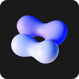 The use of simple 3D models is becoming a popular trend in web design. While your entire website doesn’t need to be fully 3D, incorporating some 3D elements can enhance your site’s visual appeal. Modern web design often includes 3D components to add depth and interest.
You might start with basic models and illustrations to give your site a stylish edge. Consider adding interactive 3D elements, such as buttons, or incorporating simple and complex shapes that move or respond to user interactions. This can bring a dynamic and engaging quality to your website.
However, it’s important to use 3D elements judiciously. Avoid overwhelming your site with too many 3D features, as this can distract visitors and detract from the overall user experience. Keep the focus on your content while adding subtle 3D touches to enhance your site.
Conclusions
The latest web design styles are both intriguing and diverse, showcasing a shift towards more chaotic and artistic directions. Trends like 3D elements, animations, kitsch, and brutalism offer unique and distinctive vibes. Additionally, adopting poster-style designs can effectively present your ideas and emphasize key aspects of your site.
However, it’s not essential to follow these trends if they don’t align with your website’s goals. The primary focus should be on ensuring that your site is functional and user-friendly for your target audience.
Incorporate various integrations, select a style that suits your website's purpose, and promote it effectively to attract more customers.
