






Viewport-Based Website Layout for a Nationwide Moving Company
Fluid, viewport-unit front-end of a 12-page website for a Ukrainian moving and storage company, built on Gulp, Stylus and Pug, with service and city pages, an office map, a multi-step move order form, reviews with filters and online payment.
| Industry: | |
| Location: | Ukraine |
| Services: |
About Project
Logistics & Moving Services — apartment and office relocation, express moves and storage with branches across Ukraine (Ukraine)
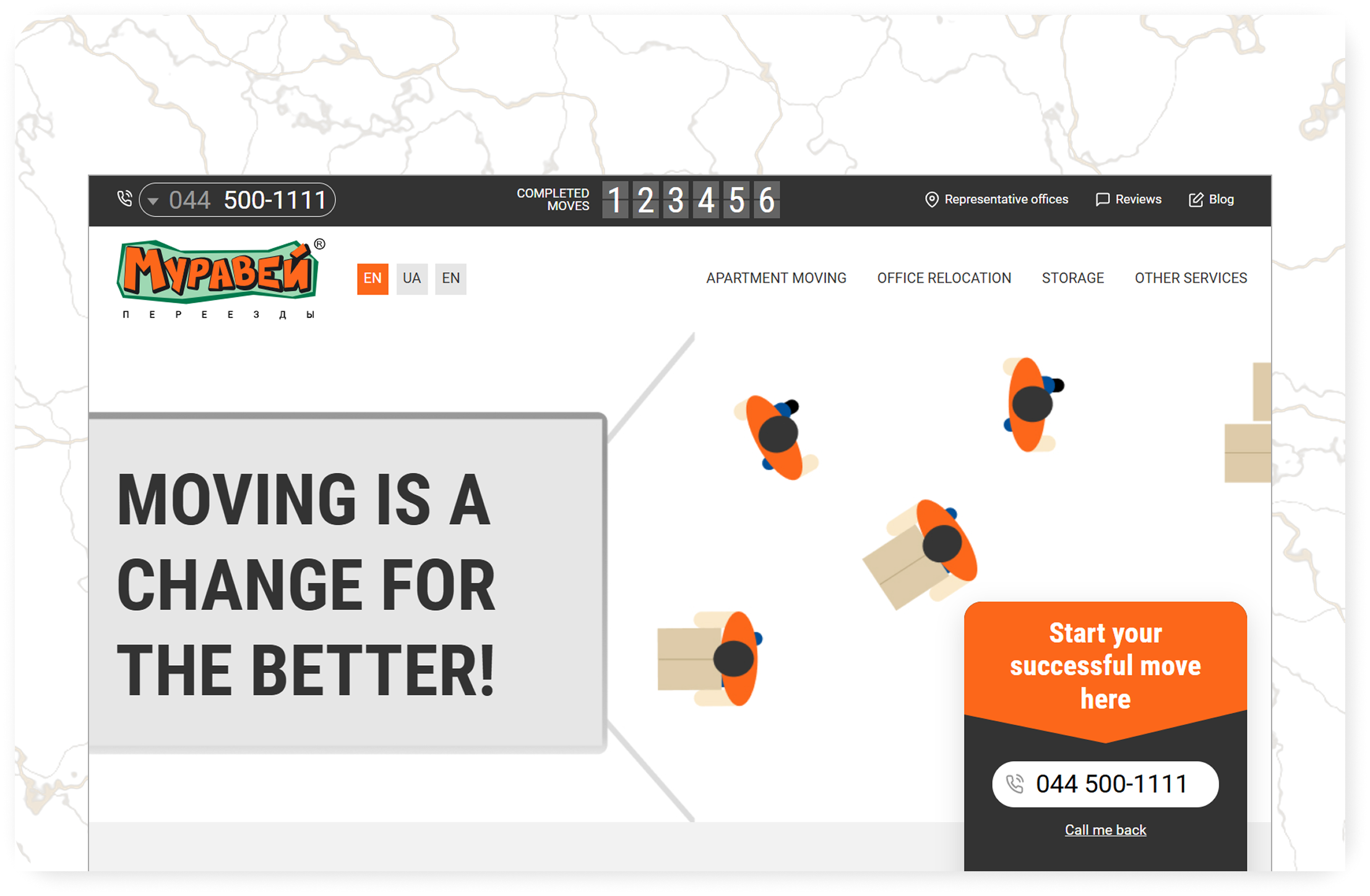
Muravey is a Ukrainian moving company offering complete relocation services for homes and businesses: apartment and office moves, express moves and storage of belongings, with branches in Kyiv, Dnipro, Lviv, Odesa and Kharkiv. Its approach goes beyond simple transportation, with professional movers, packing and planning tailored to each client. The company needed a new website that would present its services and branches clearly, explain how a move works and let customers order a move or pay online directly from the site.

Challenges
- Keeps exact proportions of the design on any screen width, from laptops to large monitors and mobile
- Presents several services and city branches, each with its own landing page
- Guides customers through ordering a move step by step
- Builds trust with reviews, company history, team and useful articles
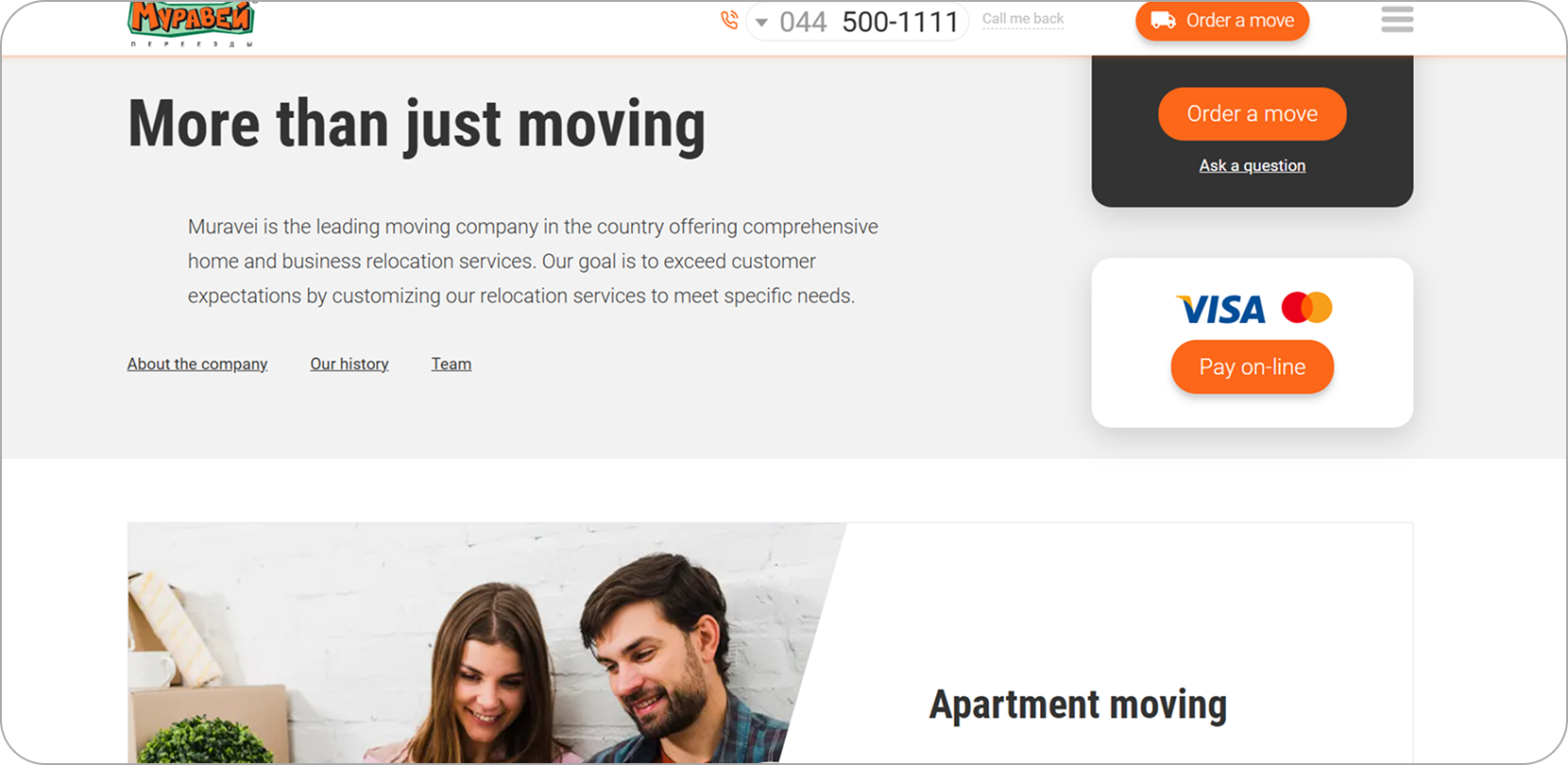
- Supports online payment and quick contact on every page
Solution
We built the front-end on our Gulp, Stylus and Pug workflow with a fully fluid layout based on viewport units (vw), so every block scales proportionally and the site looks exactly like the design on any screen.
- Creating a viewport-based layout system in Stylus, where typography, spacing and components scale with the screen instead of jumping between fixed breakpoints, plus dedicated mobile adaptation.
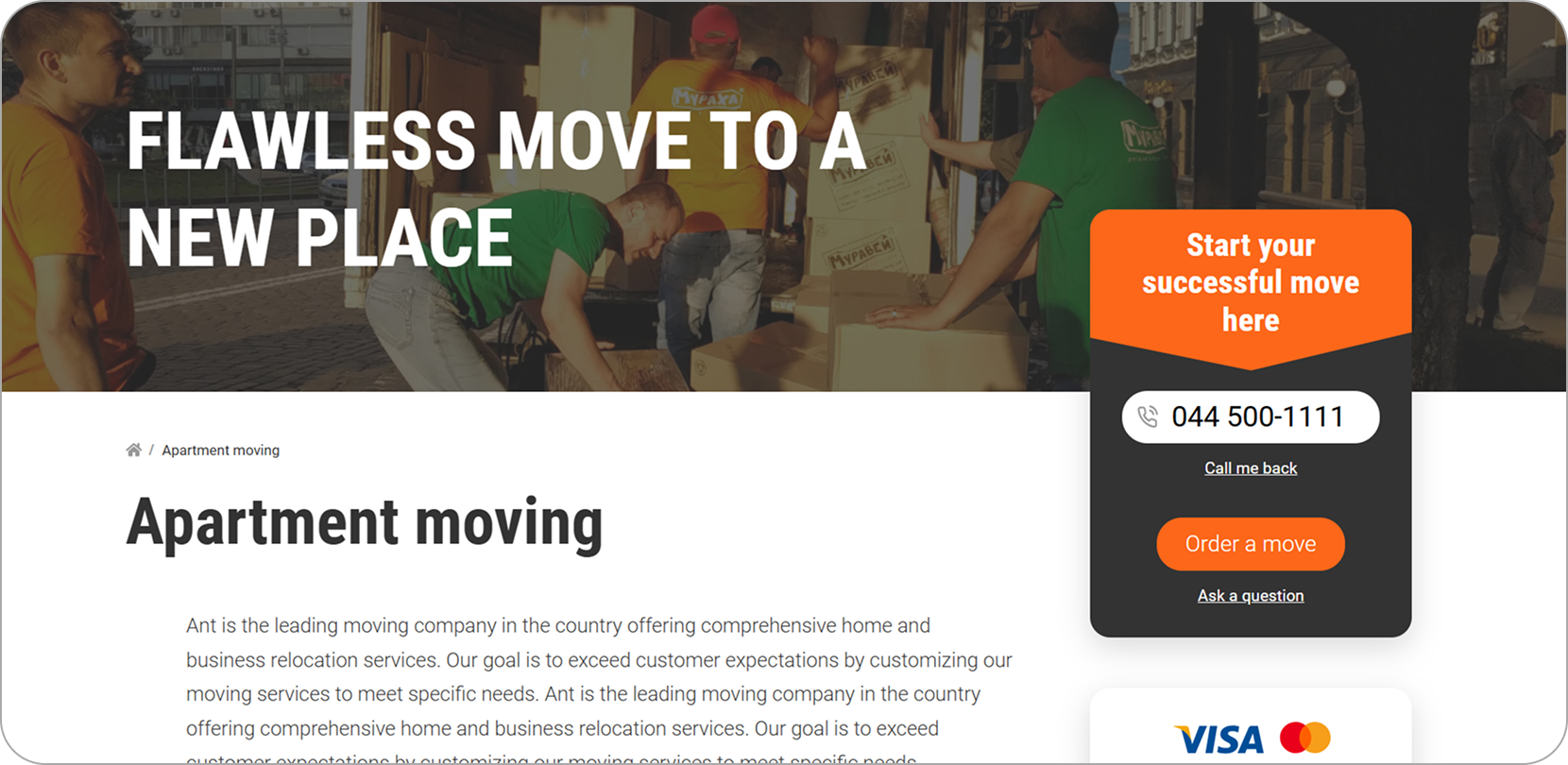
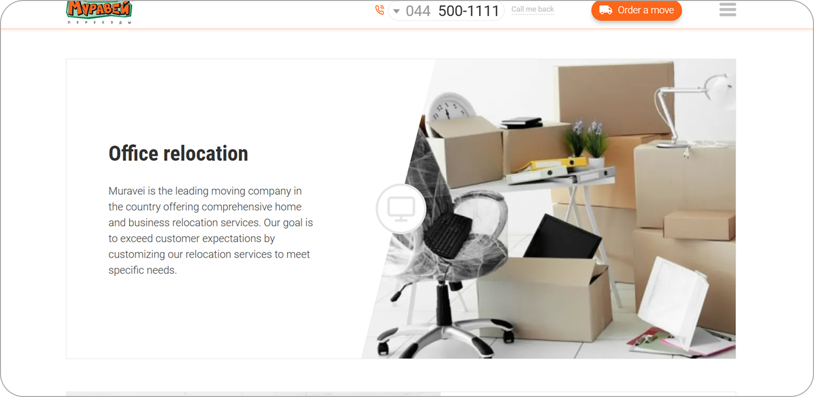
- Building reusable Pug templates and mixins for 12 pages: homepage, service pages, city branch pages, offices with a city map, reviews, about, blog, article and online payment.
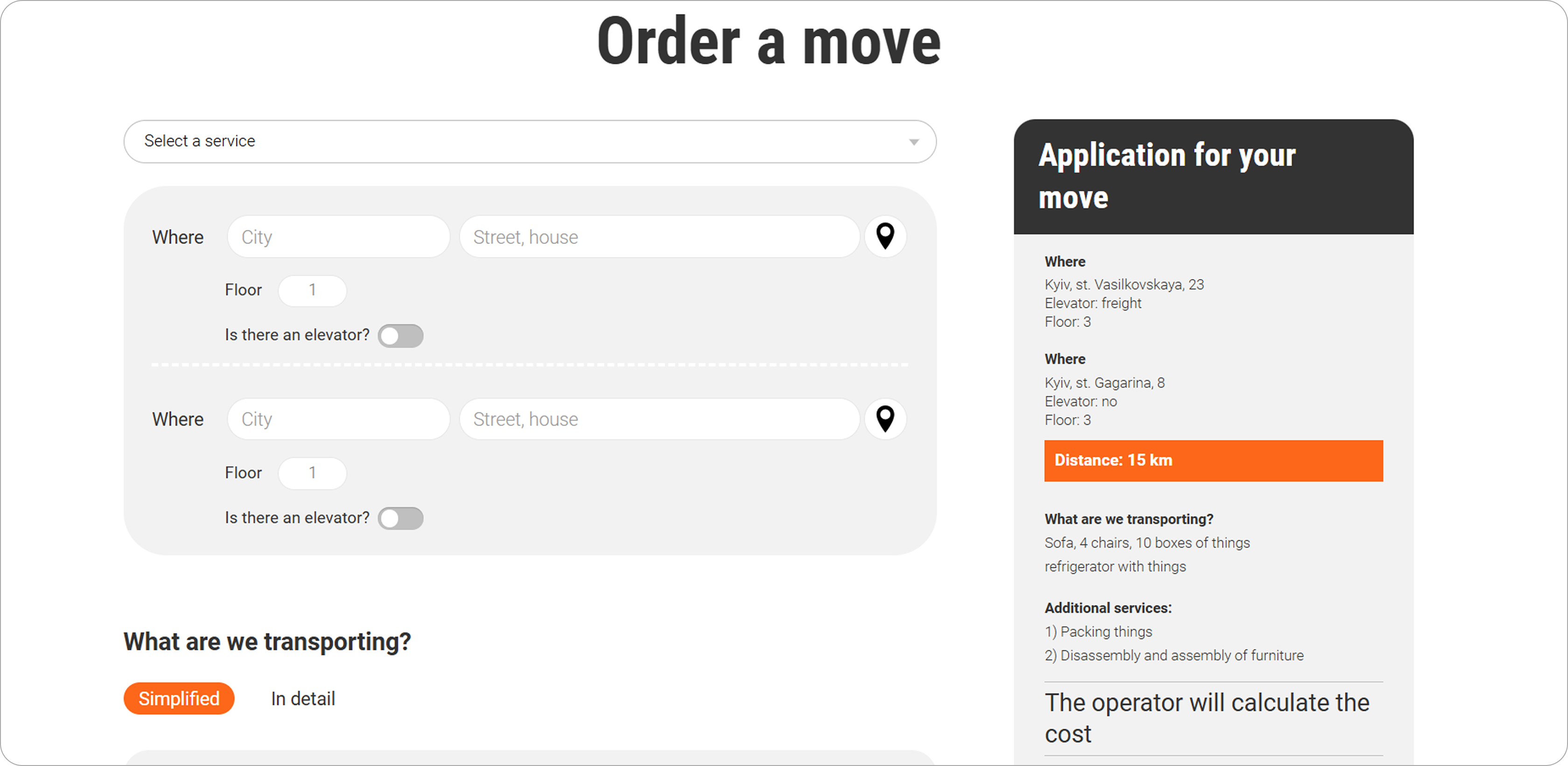
- Laying out the move order page with several states of a multi-step form, including location selection with a map marker, filters and custom selects.
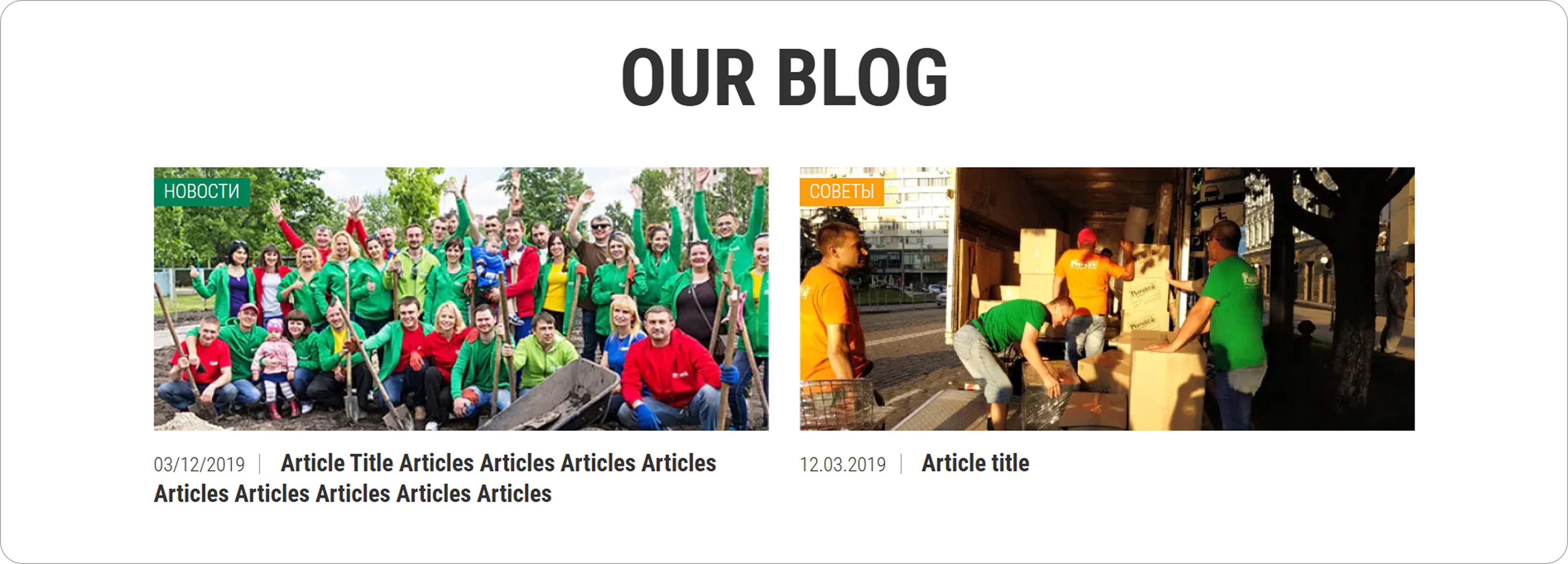
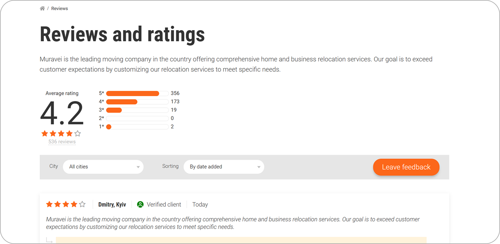
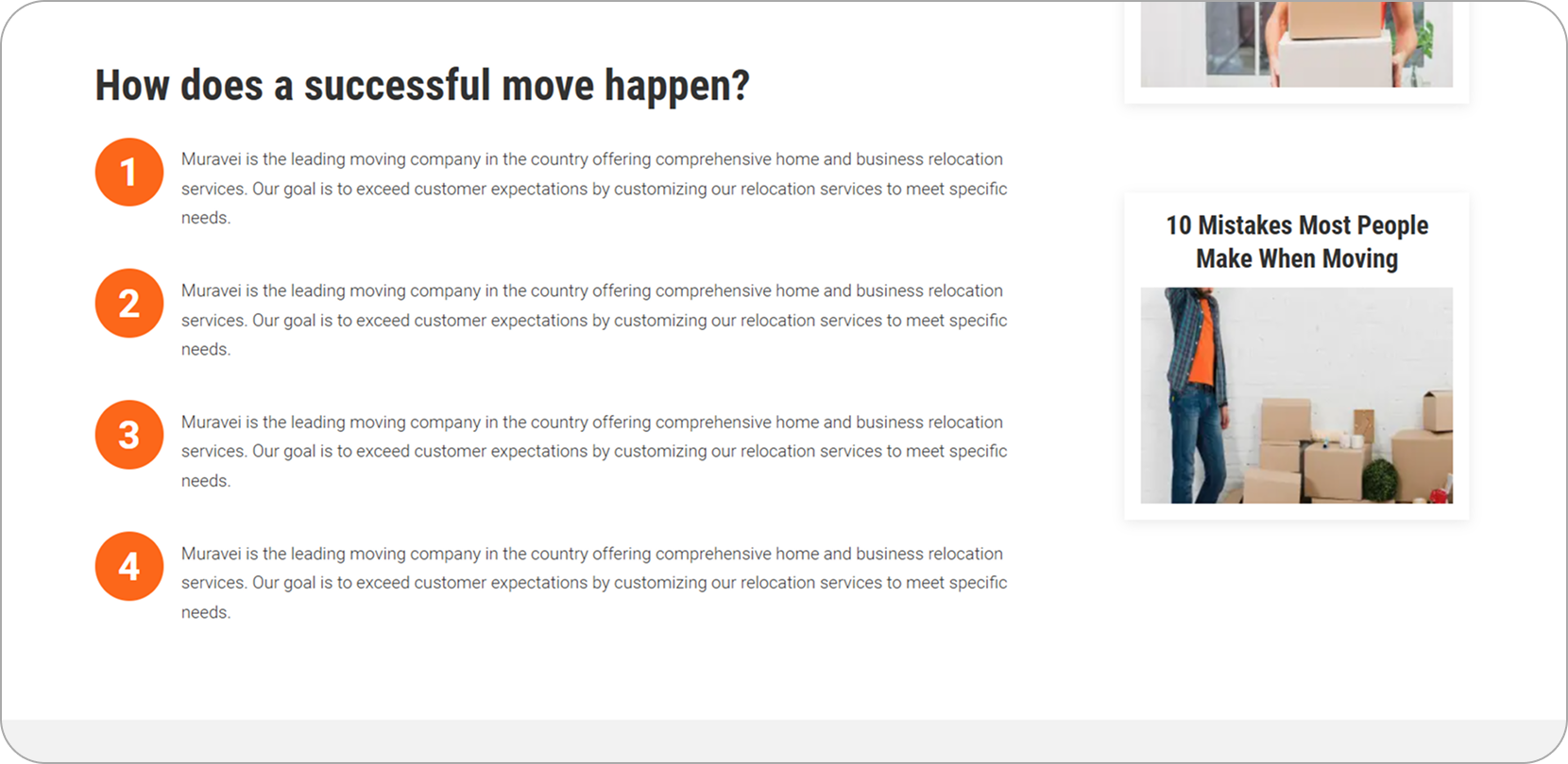
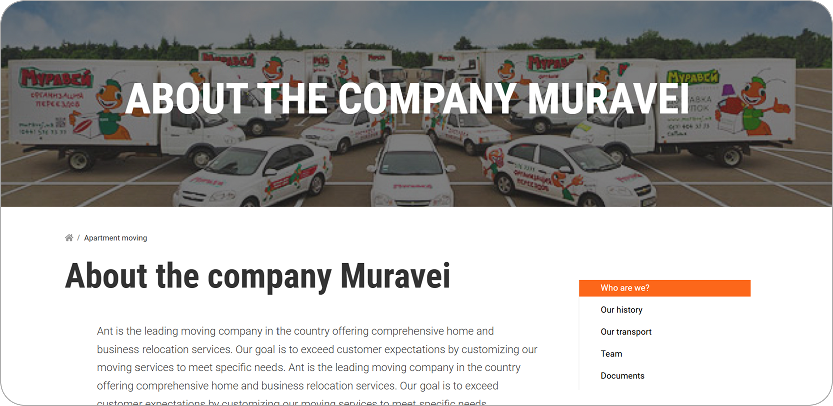
- Developing the reviews page with rating filters and sorting, the about page with mission, team and a company history timeline, and content blocks such as “How a successful move works” and “10 mistakes most people make when moving”.
- Implementing interactive elements: Swiper sliders, iziModal popups for callbacks and questions, a language switcher and a callback form available across the site.
Impact / Result
Muravey received a website that looks consistent and polished on every screen size and makes ordering a move simple. Customers can choose a service, find their city branch, read reviews and expert tips, place an order step by step and pay online, all within one clear, cohesive interface.
The viewport-based approach was the key technical decision: instead of fitting the design to a few breakpoints, the entire layout scales smoothly with the browser window. Combined with modular Pug templates and Stylus components, this gave the client 12 pixel-accurate pages built on a clean, reusable codebase that is easy to extend with new cities and services.